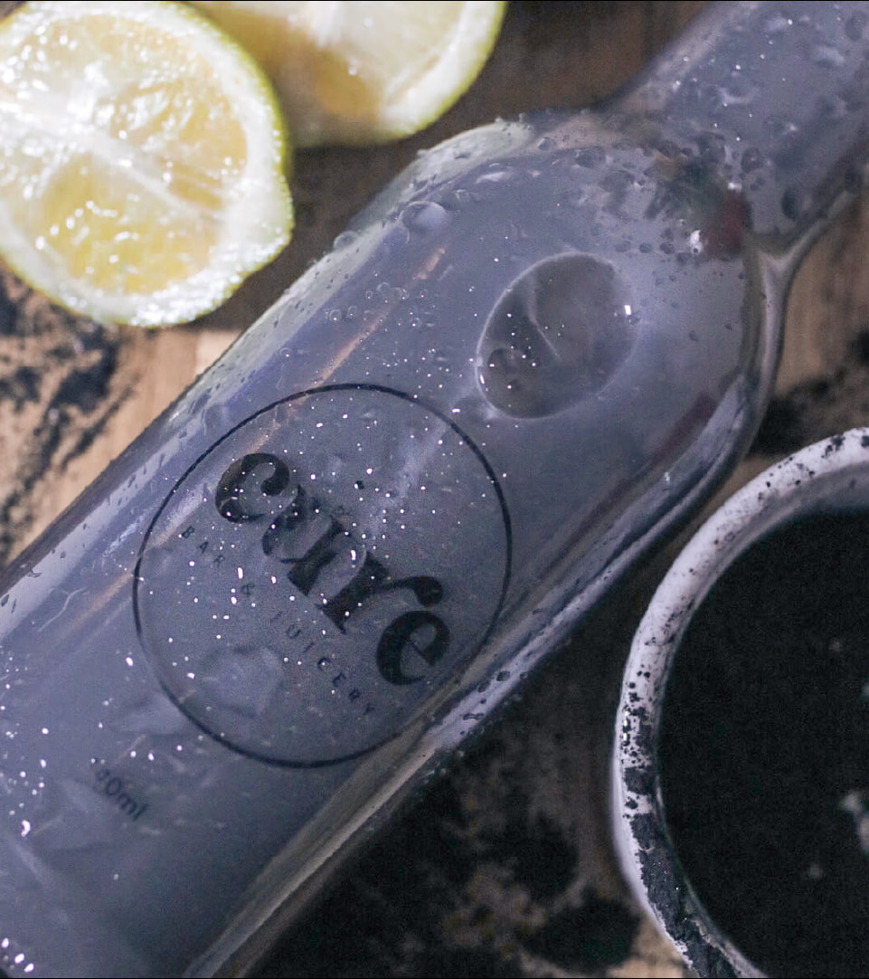
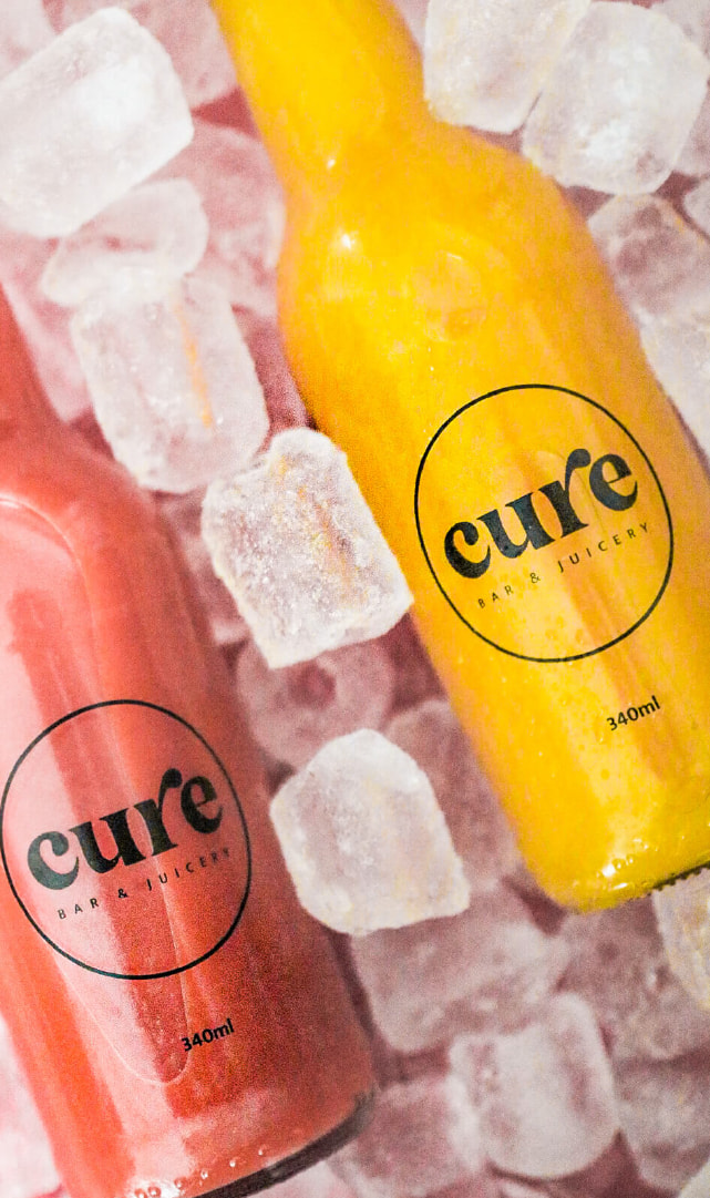
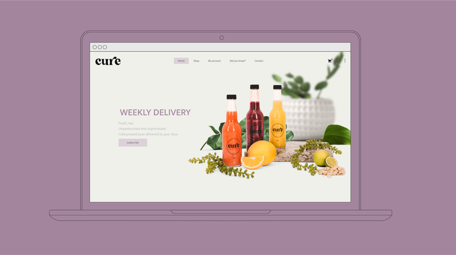
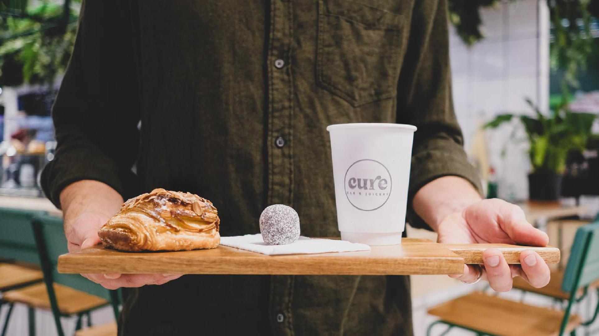
Cure Bar and Juicery creates natural juices that aim to heal the body and gut, reduce chronic inflammation, and reduce impact on the environment. They approached us in search of a simple yet striking branding solution that would translate well onto minimalistic packaging design, and we were able to create a visually striking and cohesive brand identity that effectively conveyed the benefits of their products and resonated with their target audience. We also designed packaging that was minimalistic and elegant, yet still able to communicate the key messages and values of the brand. Overall, the result was a brand and packaging design that was simple, striking, and highly effective at representing Cure Bar and Juicery’s unique mission and vision
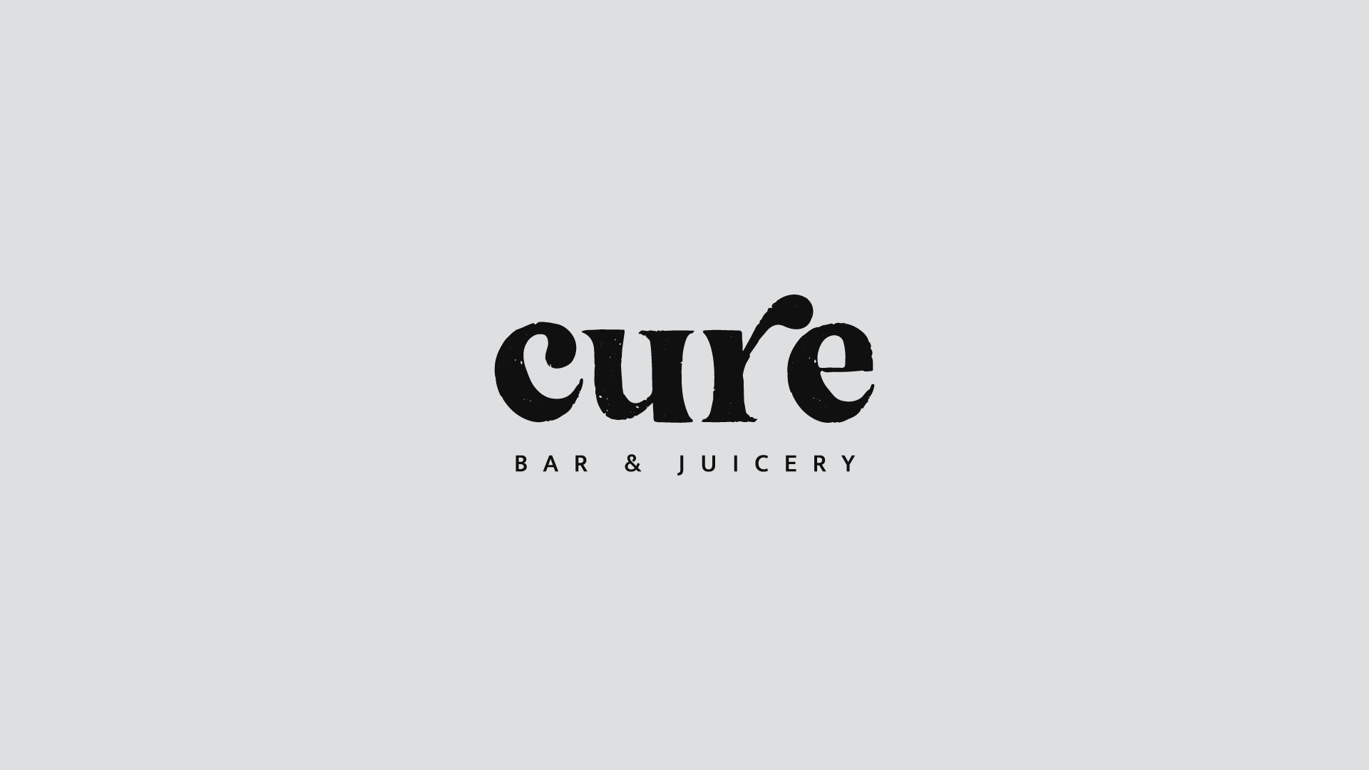
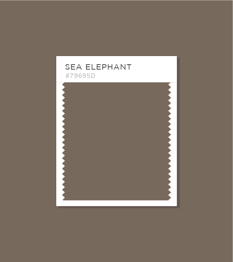
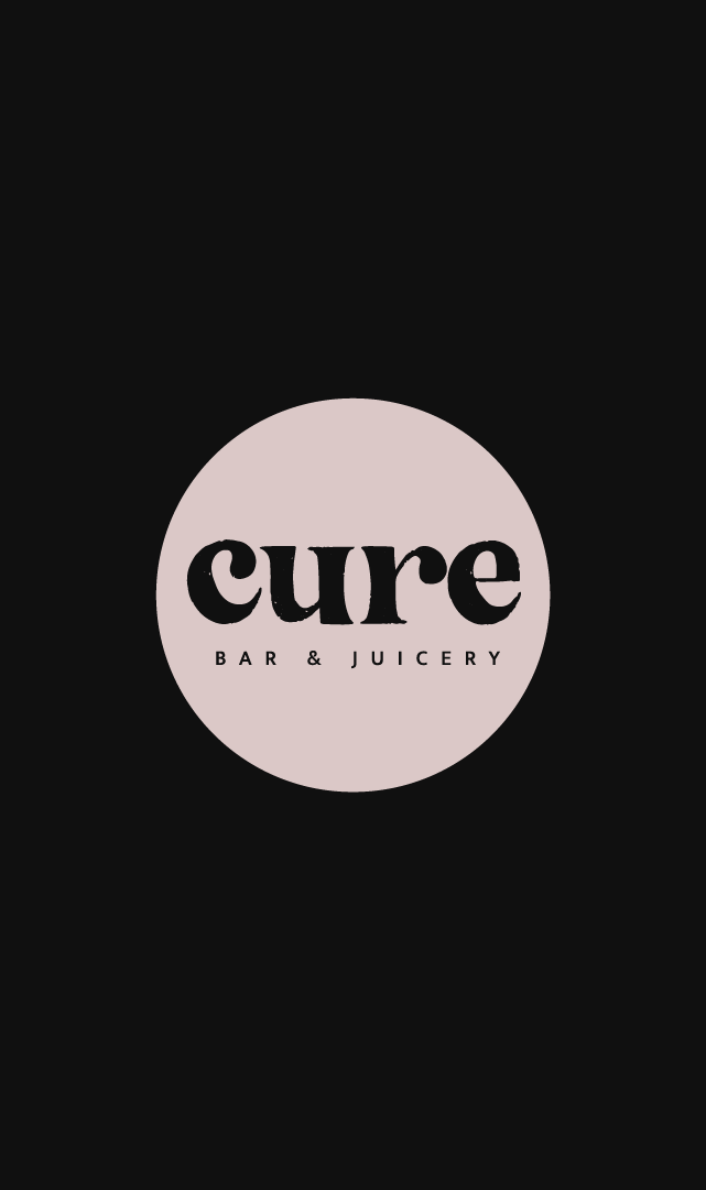
Cure Bar and Juicery is committed to creating potion-like nutrients that transform and heal the body from the inside out. The color purple was chosen as the main brand color because it signifies mystery, magic, and even sorcery. The wordmark’s “r” in “cure” has a slightly higher crossbar to further reinforce the idea of illusion and transformation. Our brand and visual identity are designed to convey the transformative power of our products and the magic of their effects. We hope to inspire our customers to believe in the power of healing and to take charge of their own health and wellness journey.