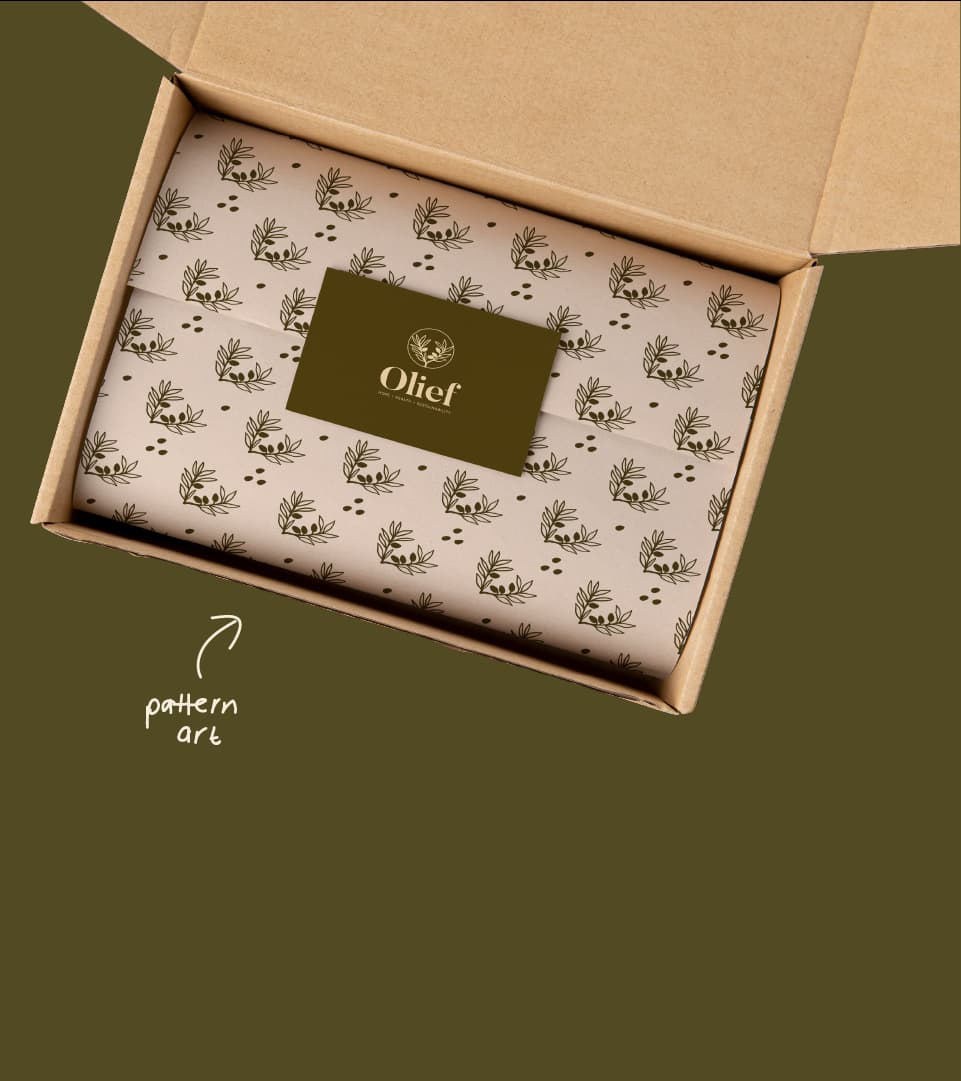
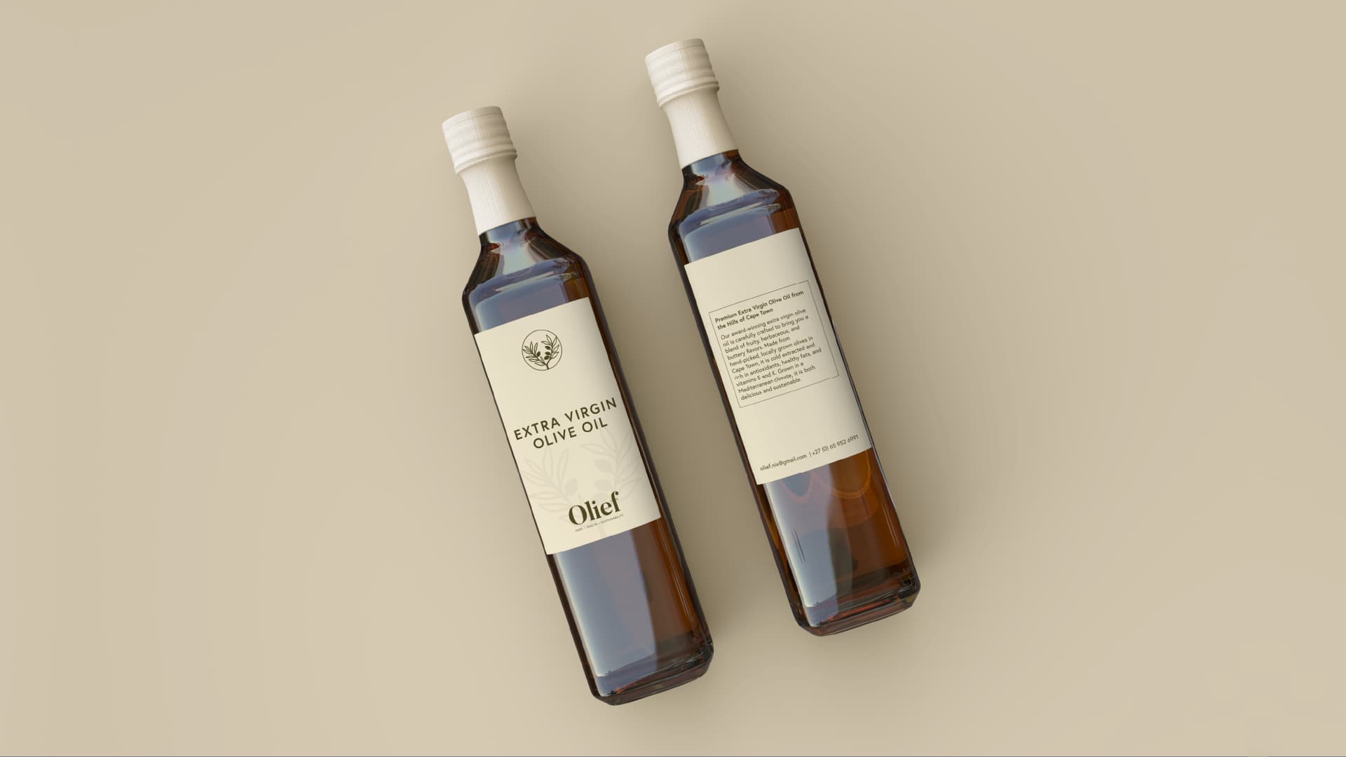
Olief, a visionary producer of olive-based products, embarked on an exciting journey to rebrand their business, aligning it with their unparalleled commitment to sustainability and love for the environment. Our mission was to create a contemporary, trustworthy, and inviting brand that captures the essence of their exceptional offerings. Collaborating closely with the Olief team, we delved into their vision, values, and distinctive personality. With meticulous attention, we crafted a new logo, brand identity system and packaging that resonates with their unique traits and core values.
Scope of work: Branding, Brand Strategy, Packaging
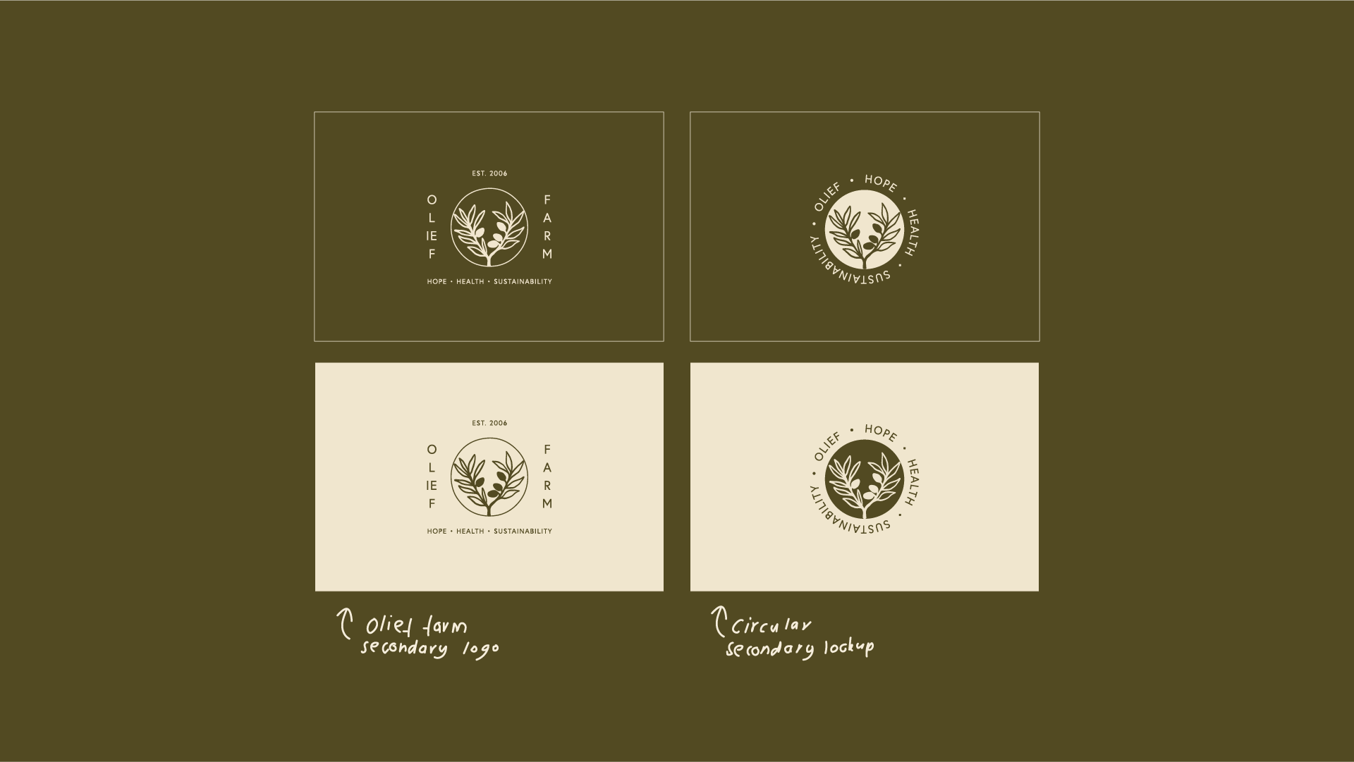
Vibe: Subtle, supportive, loving, eco-conscious
Designer notes:
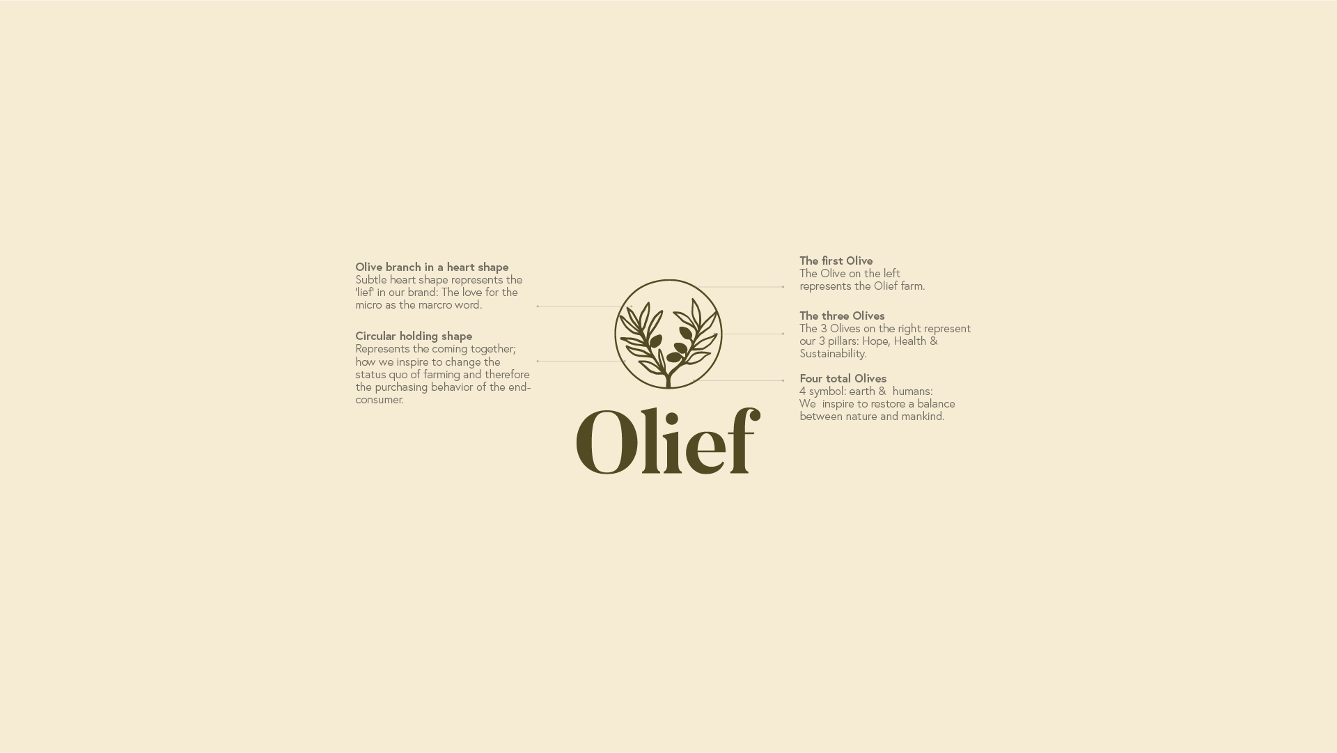
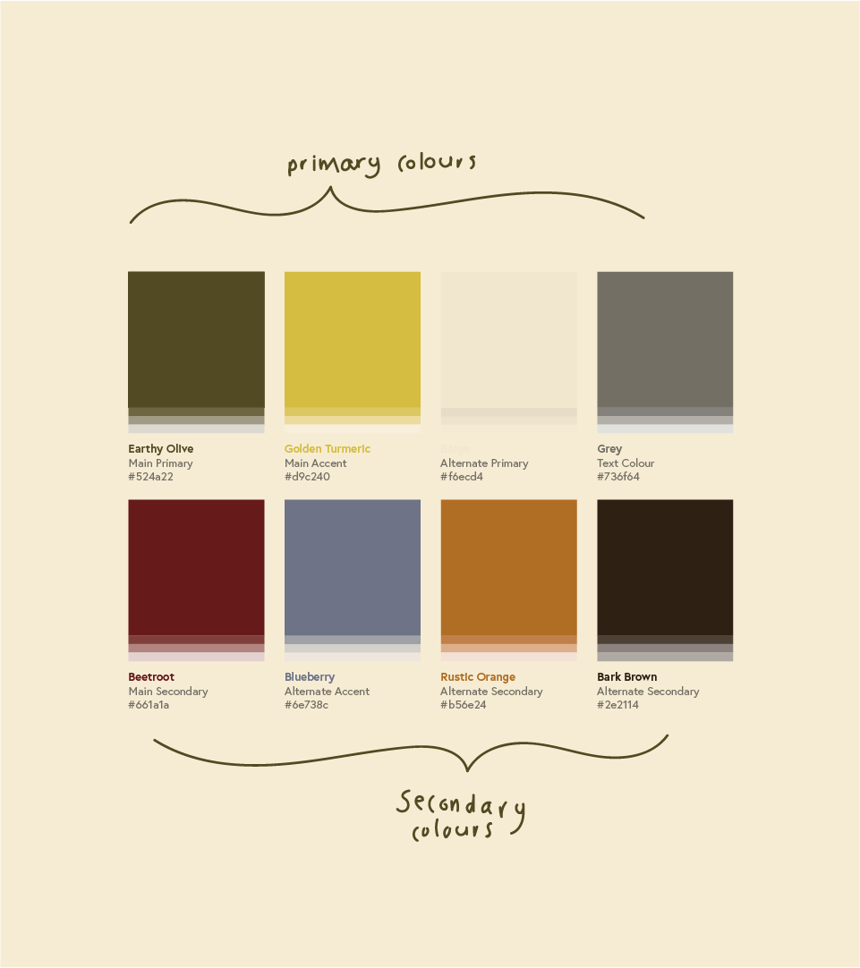
The heart-shaped olive branch icon, featured in the Olief brand design, serves as the heart and soul of the visual identity. This meticulously crafted emblem encapsulates the brand’s deep-rooted love for olive-based products and the environment. The choice of earthy colors further reinforces the brand’s commitment to the environment and evokes a sense of wholesomeness. The typography was carefully selected to strike a balance between modernity and approachability, ensuring that Olief’s message of sustainability and health reaches a broad and diverse audience.
Kind words:
“Carina is a super skilled graphic designer whom I can’t praise enough. She is attentive and detail-oriented and takes the needs and requirements of her client seriously. She is professional and reliable, while being super creative and highly imaginative and can come up with unique and visually appealing designs. Working with Carina has been an absolute pleasure, and she would be an excellent choice for anyone seeking a graphic designer with a keen eye for detail and a strong creative vision.” – Nix van der Westhuizen, CEO of Olief Farm