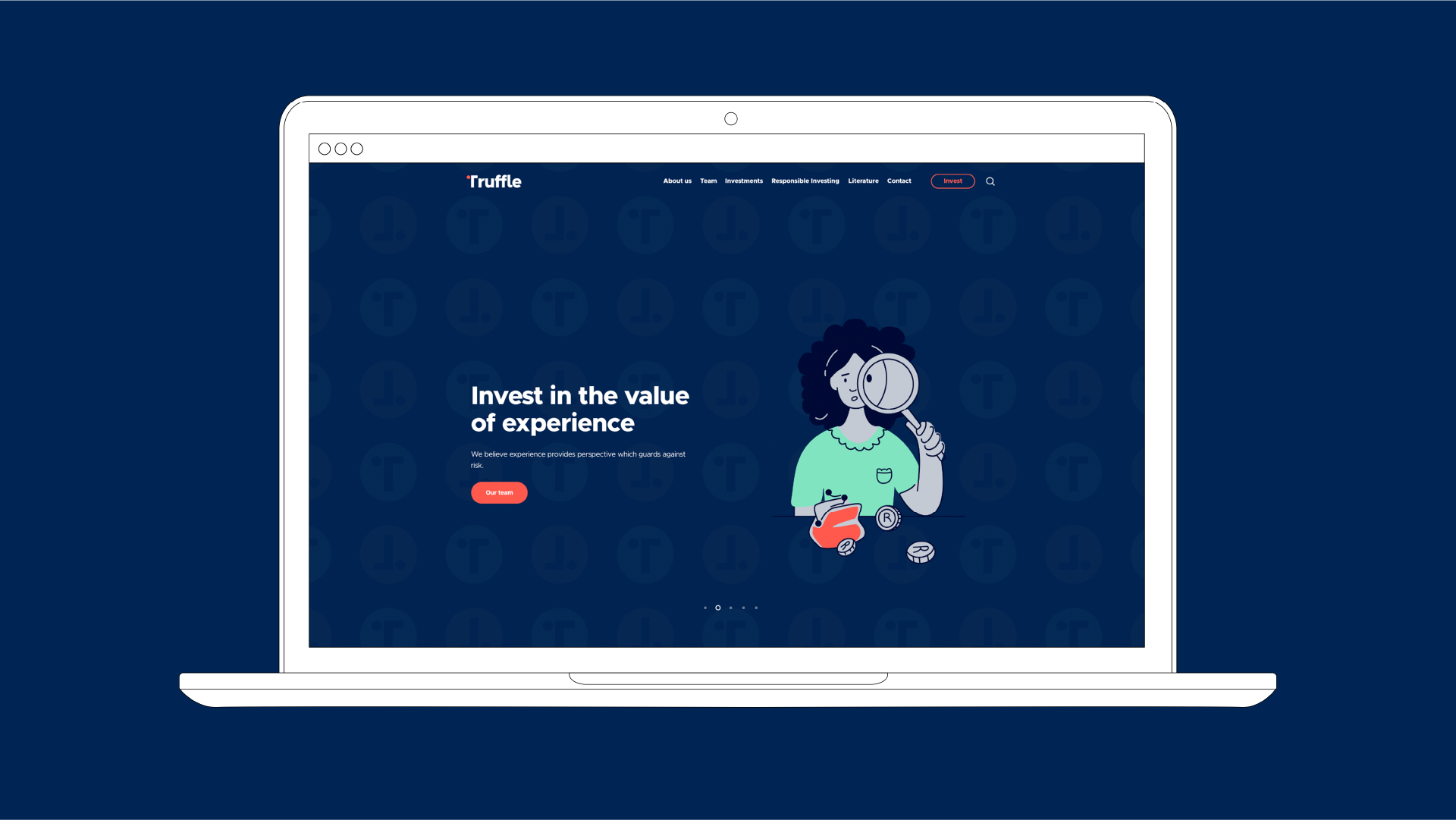
Truffle, a specialist asset manager, approached us with the goal of rebranding their company to match their award-winning services better. The aim was to create a modern, trustworthy and accessible brand that conveys the precision and compliance required in the field of Asset Management. Working closely with the Truffle team, we established their vision, values, positioning, and personality. We developed a new logo and brand identity system reflecting their unique traits and core values. The final product solidified Truffle’s positioning as a modern, reliable, and relational Asset Management brand.
Scope of work: Branding, Brand Strategy, Positioning, Collateral, Illustration
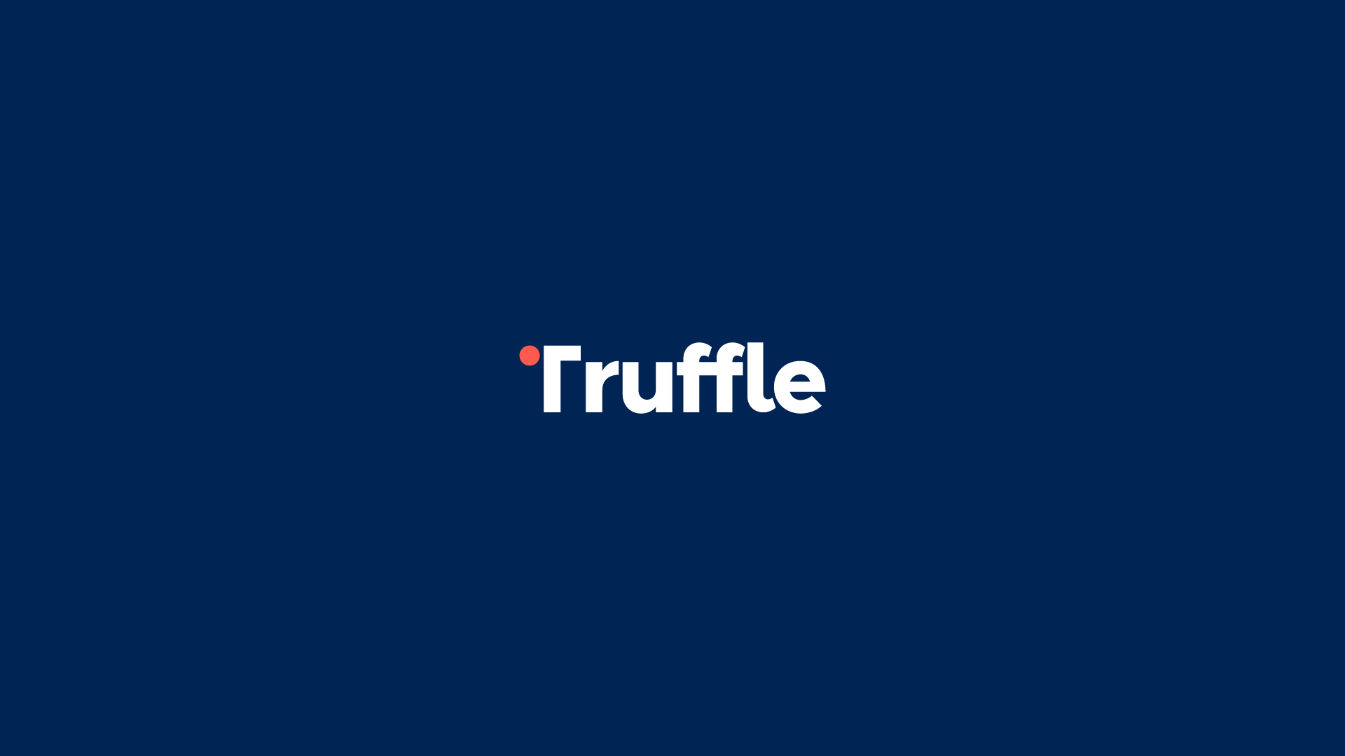
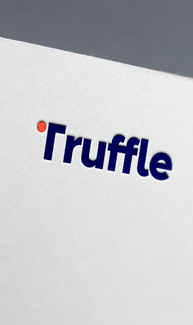
The Truffle logo, with its wordmark and ‘T-dot’ symbol, was designed to represent the brand’s values of reliability, precision, and performance. The ‘T-dot’ symbol not only serves as a visual representation of the letter ‘T’ in the word Truffle but also communicates the brand’s persistent pursuit of excellence in asset management. The use of a simple, clean font for the wordmark enhances the brand’s accessibility and easy-to-understand nature, while the ‘T-dot’ symbol adds a distinctive element that helps the brand stand out from its competitors.
Kind words:
“Great working with Carina. She is very creative and takes the time to understand your business and what you are looking to get out of the exercise before diving in. Appreciate her guidance and support on our rebranding project. “ – Simone Sharman, Head of Distribution, Truffle Asset Management